Showing posts with label colour. Show all posts

Wednesday, 29 May 2019

Paintings on Interiors done this year

I attended classes this semester with Michael Winters where we looked at the Australian women artists of Grace Cossington Smith, Margaret Olley and Elizabeth Cummings. The course was about how they treated Interiors as a subject in quite different ways.  The outcome were some acrylic paintings on 100 x 60 canvases using the rooms in my own house.

If interested they have a lot of work on the internet.


Interior - my house


After Grace Cossington Smith, a Sydney artist who used lots of broken colour in her interiors.


Interior - still life in my dining room

This shows a Chinese still life on a piece of Paraguayan lace on my dining table.  It is an interior but not in a particular style.  It was supposed to represent Margaret Olley's detail but is nothing like her  work.
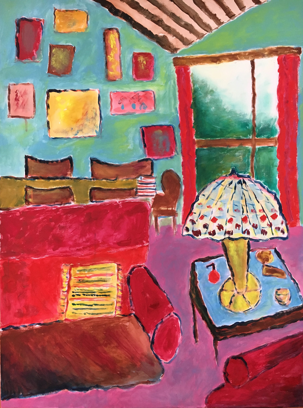

Interior my house


Elizabeth Cummings is still alive in her 80s and shows an amazing use of colour, semi-abstract work but very difficult to get a handle on her style.  There are no straight lines but lots of line variation.
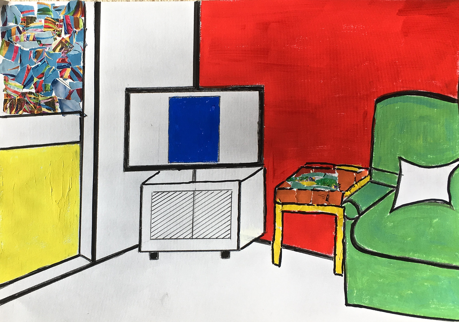

Interior of my house


This painting is on A3 paper and is emphasising space as well as plain flat colour with some collage. I really enjoyed doing this.
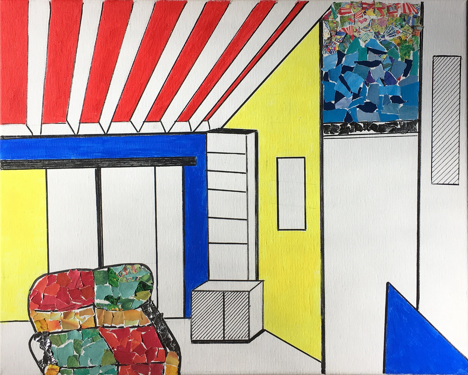
Interior of my house


This painting is similar in style but painting in acrylic on canvas.  Fun to do at the end of the course.


Monday, 16 January 2017

My abstract mixed media art

Early this month I went to the Summer Art Experience in Canberra.  It was a 5 day summer school run by the Artists Society of Canberra.  Tracey Creighton was the teacher of my class called "Organic Abstracts."  She was a great teacher and pushed us, so it was a challenging time and we were all exhausted by the end of each day - making gelli prints, using binder medium for collage, acrylic paint, string, cardboard - anything and everything to make our abstracts on canvases.  Between the layers we ran outside to dry layers!

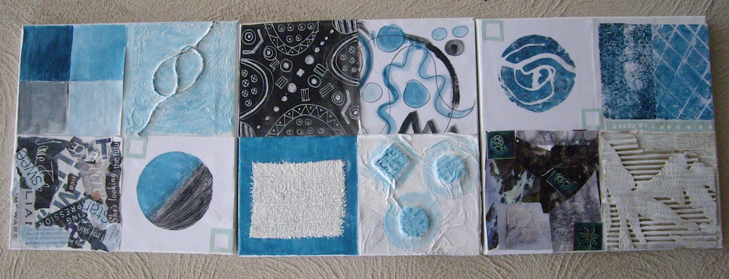
We began with a series of exercises on three small canvases using one colour and black and white.  We kept turning them around to see how they went togther .  Here is my result


Abstract Mixed Media


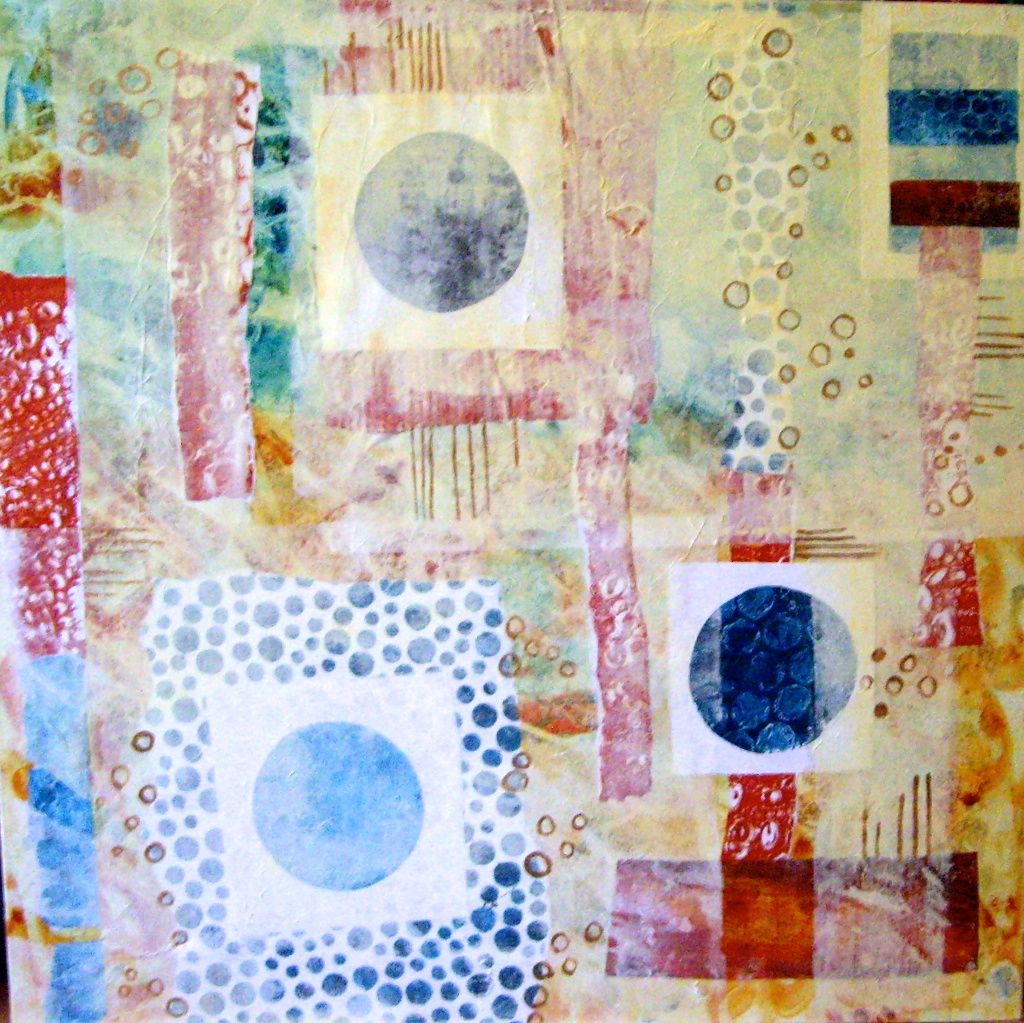
Using a larger canvas 60 x 60cm  we had the theme "Circles and Lines".  We had to keep to the same colour we had used in the exercises but could add either a complementary colour or an analagous one.  And of course these could be mixed.  I added red-gold which I love as a contrast.  Some more gelli printing gave me plenty for collage and layering but I had trouble making it unified until I glued rice paper over much of the work, scratched some away and added details in pen/paint.  Here is the result

Abstract Mixed Media

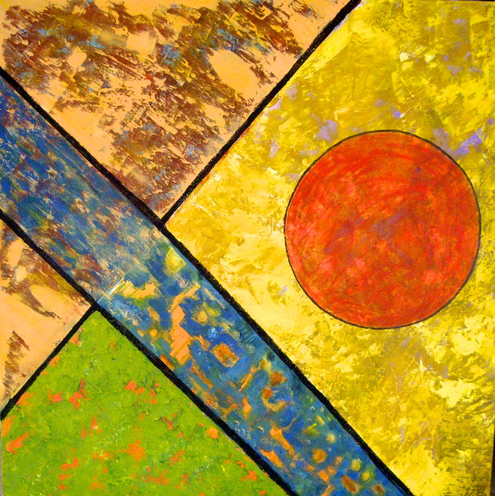
Another 60 x 60cm canvas was used to paint several layers, scratching them back etc. We divided the canvas into 4 and could use similar colours to the last one.  I added red for the big circle as I always like bright colours!  We also learnt about the use of apps such as "Diana app" to contribute to our art.  But we didn't actually use them in the class as there was no wifi available and not everyone had a smart phone.  But the demo showed what could be done. and sure gave some inspiration.

Abstract Mixed Media

Friday, 3 June 2016

More Pastel Paintings

I've been back a few weeks from my trip to Sicily and Oman but am not sure if I can post the slideshows I have made of my photos.  I will try later.

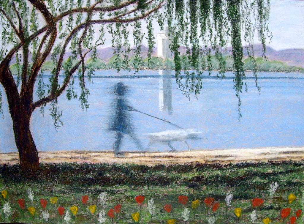
I'm now looking at some of the art I did earlier this year and am posting it here.  This pastel called "The dog walker" is based on a colour slide I took twenty years ago during the annual Floriade festival we have in Canberra.   The camera was set on a slow shutter speed to blur the moving person and dog and I've always liked it.

Walking the dog

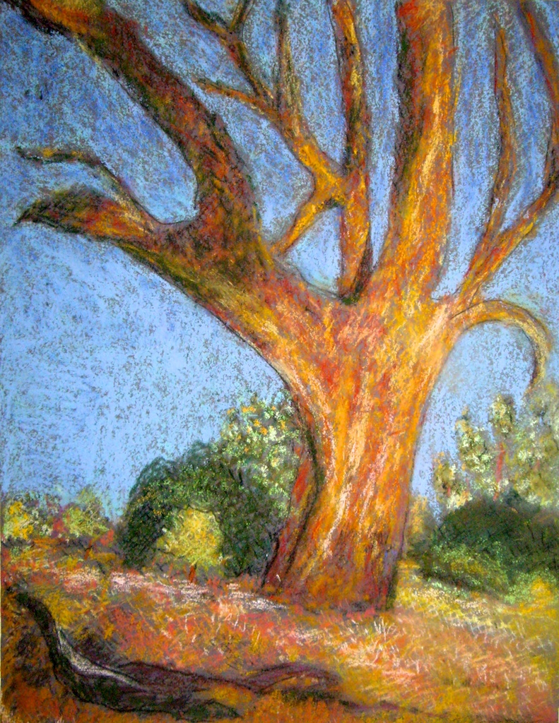
 I did the next two pastels in a weekend workshop by Louise Corke with a concentration on light and composition.

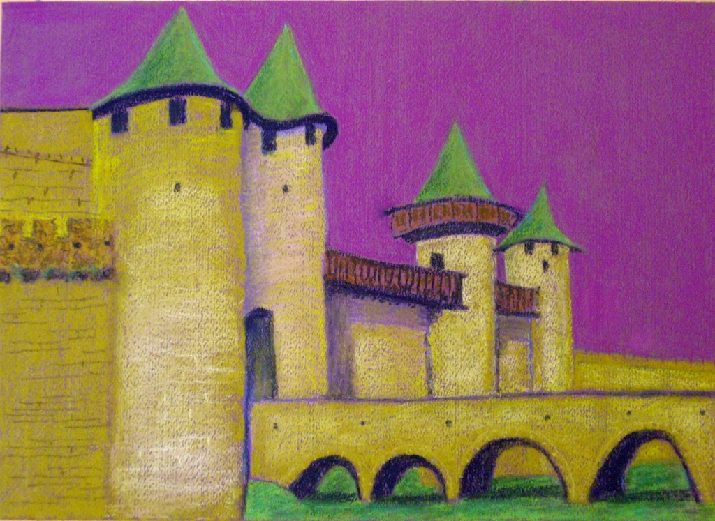
One painting is a landscape with trees in the foreground and background;  the other is from a photo I took several years ago of the citadel of Carcassonne in France.


Pastel painting


Pastel paintings


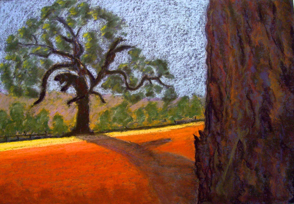
I just finished this pastel of an old tree trying to use a cross-hatching technique in hard pastels to begin it - then scumble in soft pastels. I'm not sure how it has worked.

Pastel paintings


Wednesday, 22 July 2015

Painting showing colour of Fauves

It has been a long time since I posted on this blog as I have been overseas in Scotland and England for 2 months, seeing the Scottish Isles and renting a car to visit many friends in England.

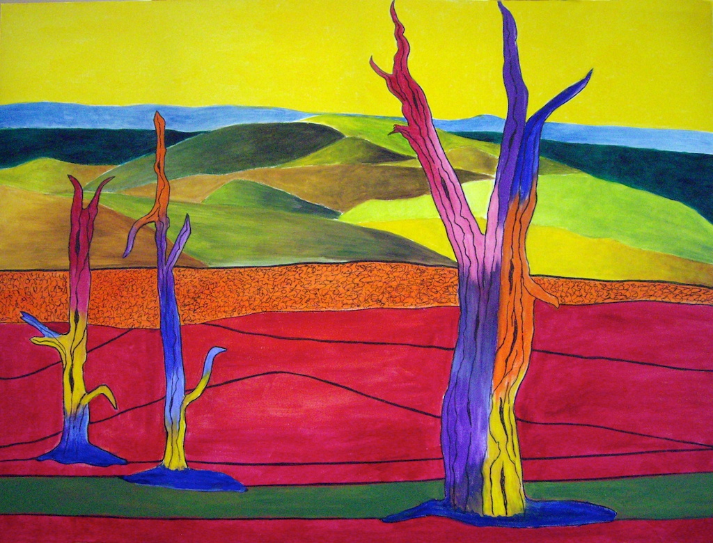
I am now settling back into the routine of printmaking and painting each week.  This large painting (100x70cm) on stretched canvas is painted in acrylic.  I have composed it to reflect the style of the three artists we studied in last semester -  Andre Derain's amazing colour, Dorrit Black's hills with shading, and a little bit of scribble from Michael Shannon.

I intend to put it on my wall after giving others on the walls a rest - no room for any extra paintings.  My walls are full!


Colour in the landscape

Tuesday, 28 April 2015

Art after Andre Derain

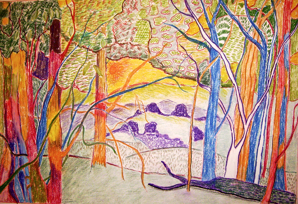
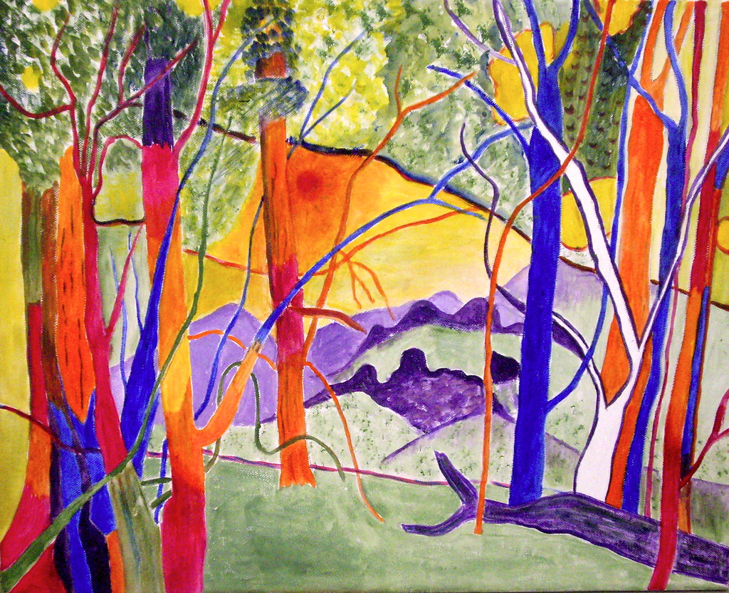
The third artist we are studying with Michael Winters is Andre Derain, from the Fauve Movement - "Wild Beasts" in French. It was a loose group of early twentieth-century Modern artists whose works emphasized painterly qualities and strong color over the representational or realistic values retained by Impressionism.

Since I love colour, this suited me really well and I have made two artworks so far - the first using pastel pencils (stronger colours than coloured pencils) and the second acrylic on canvas.  The photo I worked from was one I took near Adaminaby some years ago.


Australian landscape in Fauve style


Australian landscape in Fauve style


Friday, 9 May 2014

Tryptich painting - after Matisse

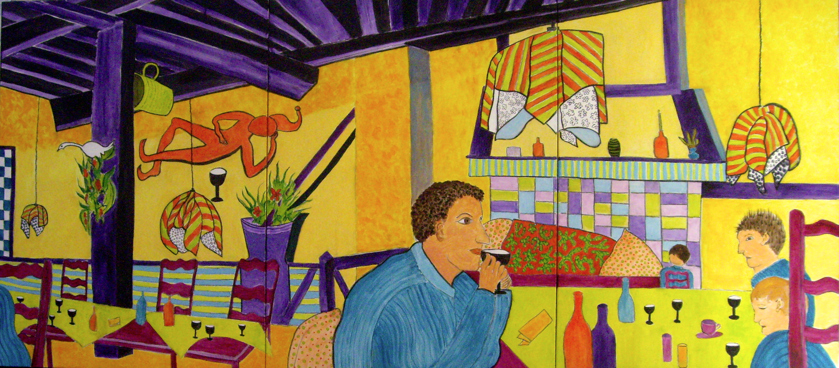
I've been working on this huge tryptich for the last 6 weeks.  Michael Winter's class is looking at the work and style of Henri Matisse.  We were to paint an interior with at least one person in it.  Most were looking at photos of home but I decided to use a quirky photo I took in 2006 when I was in the medieval city of Carcasonne in the south of France.  I was alone and looking for a place for dinner but I think I was the only person eating - everyone else was drinking!

We were to join 3 canvases together to make a tryptich. The size influences the way one sees and paints. It was quite an experience.  The final size is 2.3m x 1m  (or 90" x 40").  Even balancing the canvases on the easel was hard with clamps used at the back.

The painting was drawn in charcoal and painted in acrylic using six tertiary colours which were harmonious.  I feel that the painting is more about colour than anything else - and Matisse also used unusual colours.  I made areas of impasto/texture and also flat areas with emphasis of line in places.  It was great fun to make this painting and I've already decided what to move and where to put it on a  high wall in my house.

Click on photo to see a larger size.

Tryptich painting - after Matisse